Bojie [2019]
Bojie is a fashion label from Hawaii which sells conscious women's clothing with a bohemian touch. Its spirit is alive, forward, free, vibrant and flowing – it expresses the female in all forms.
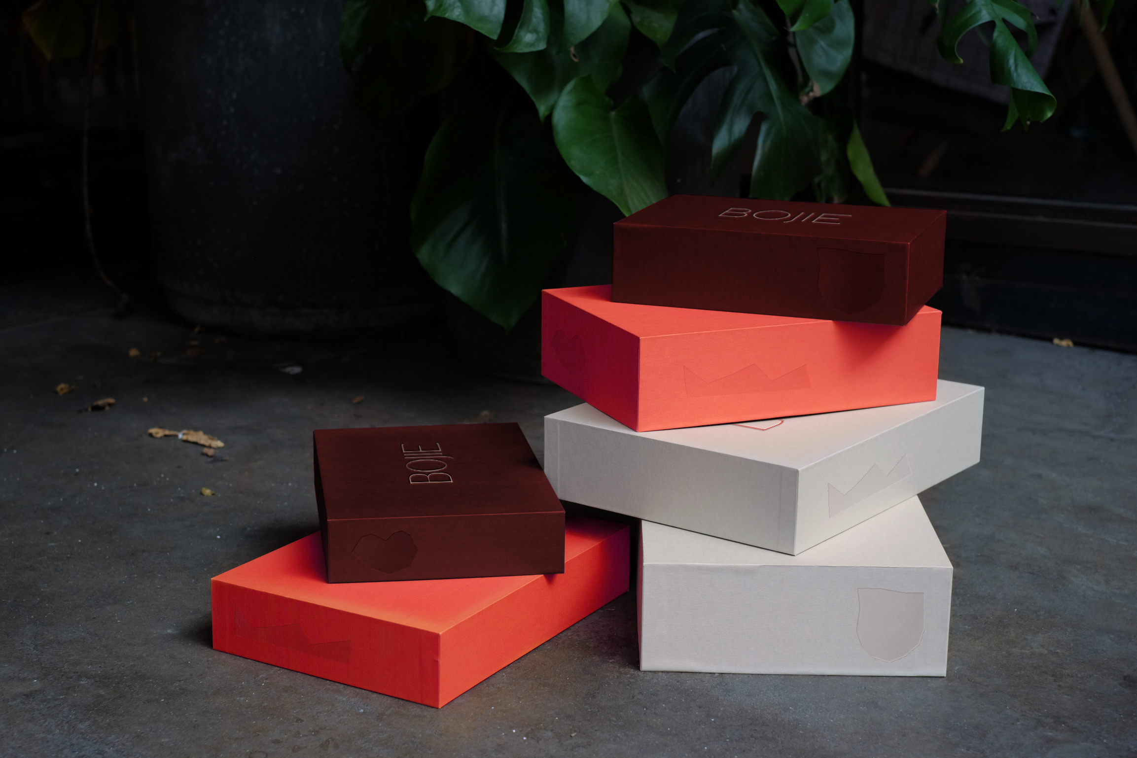
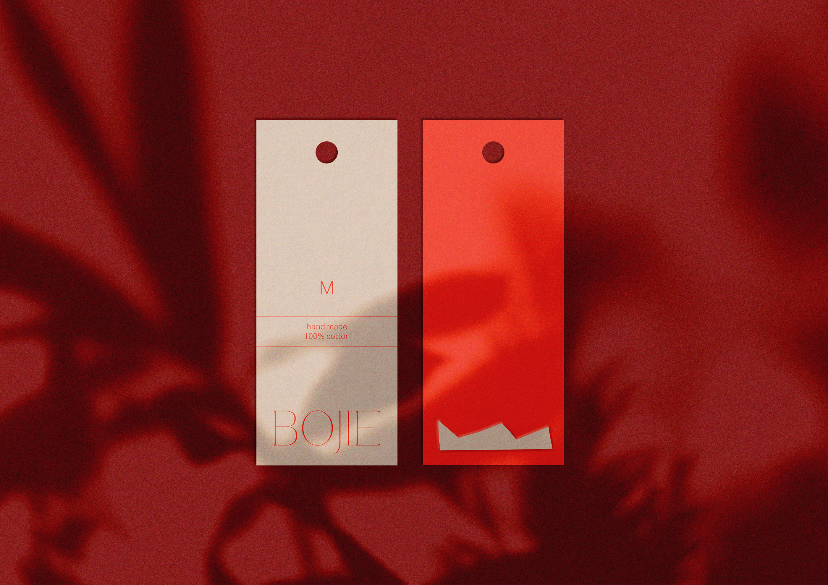
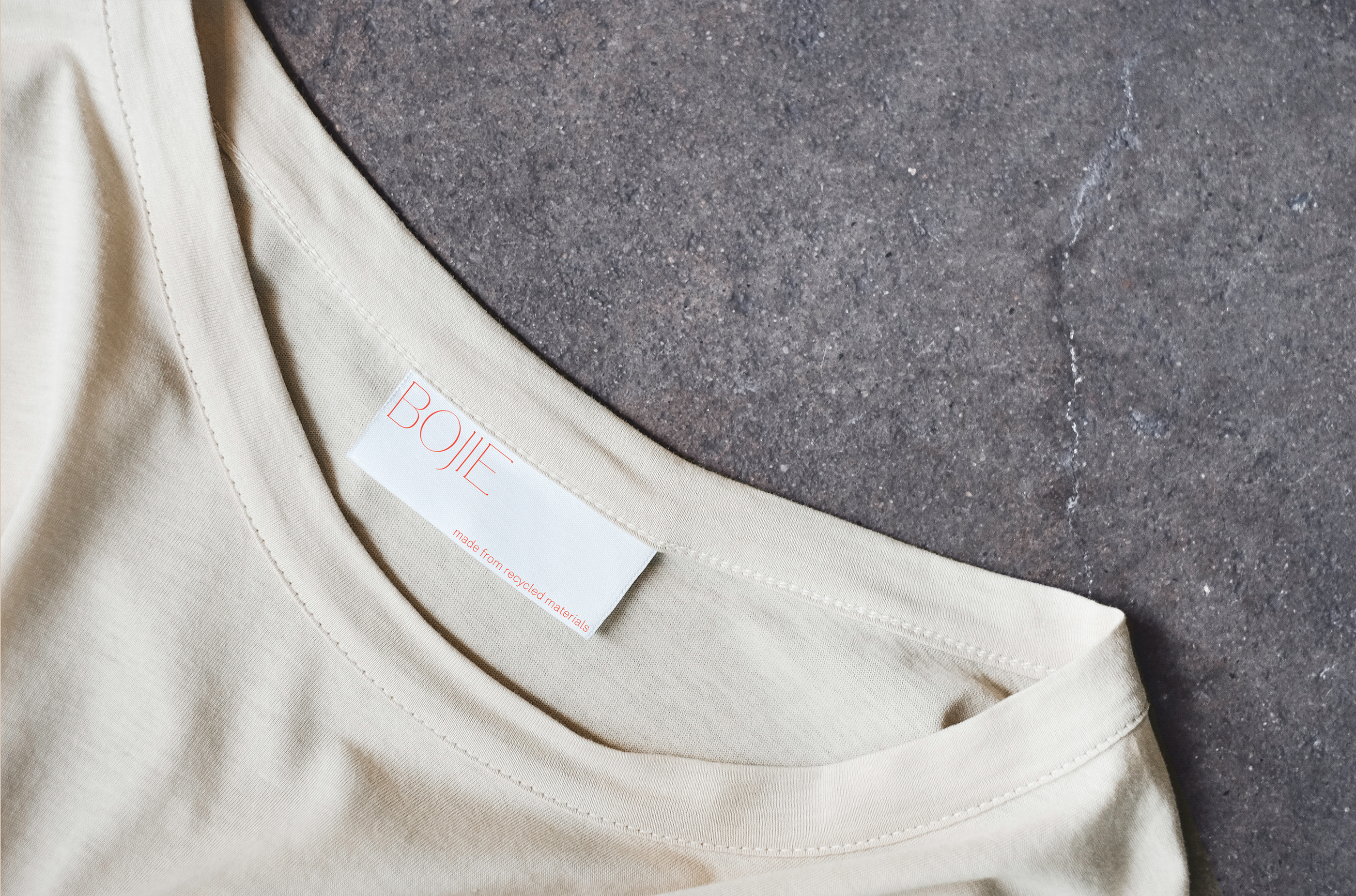
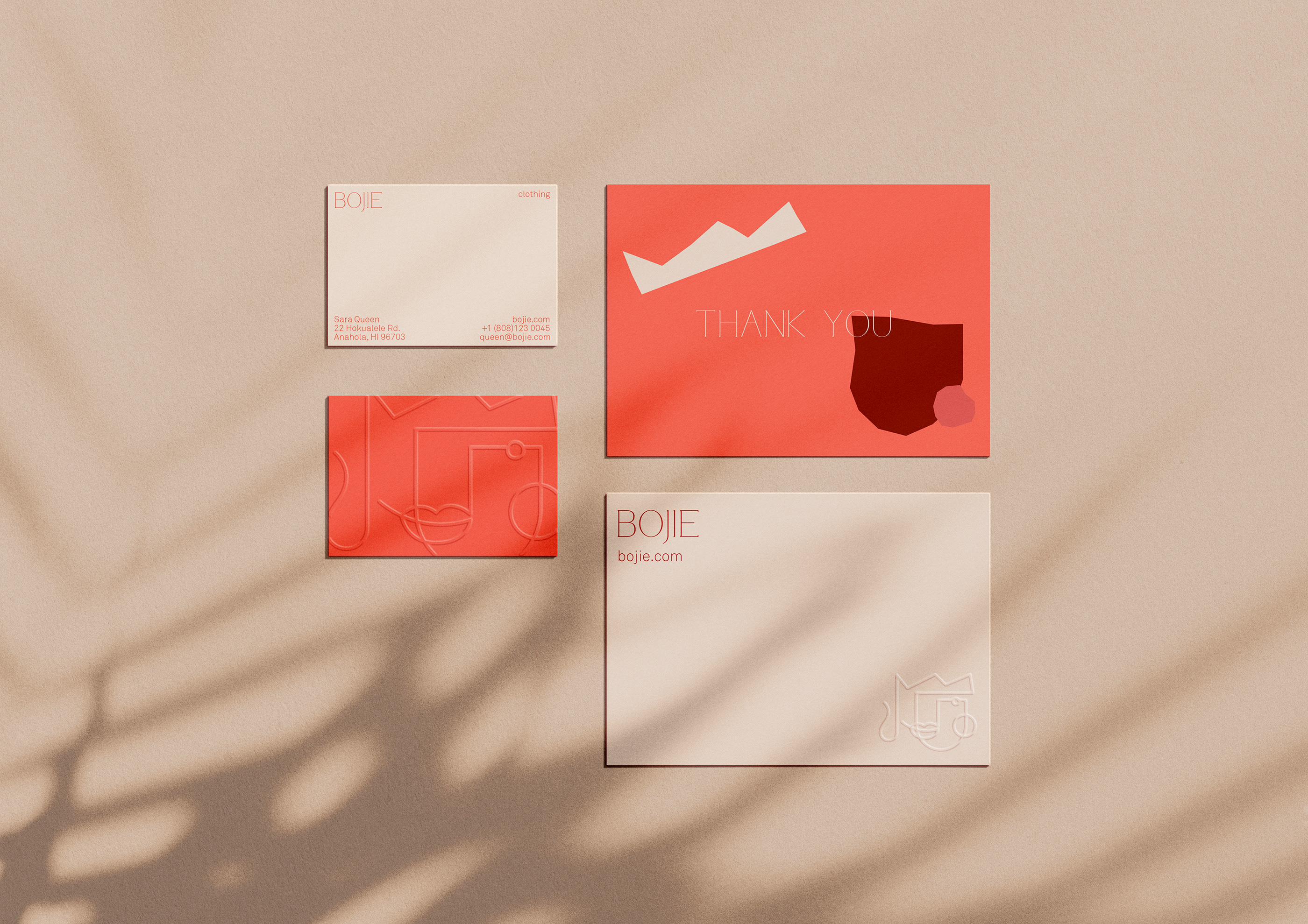
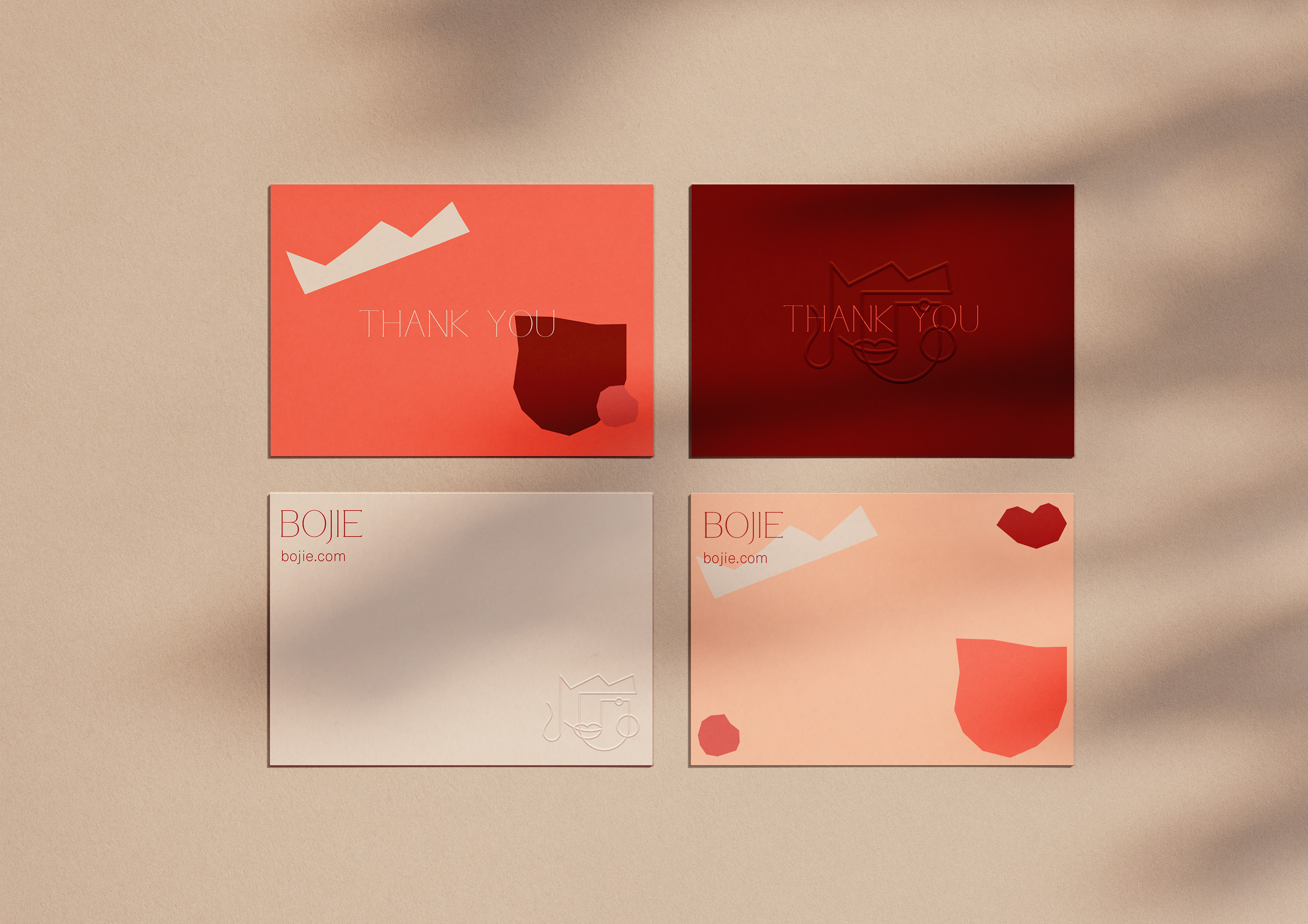
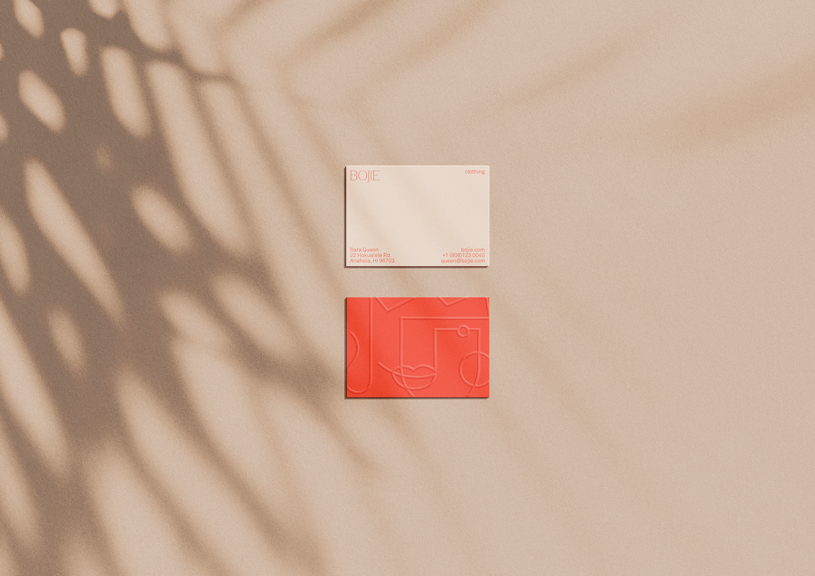
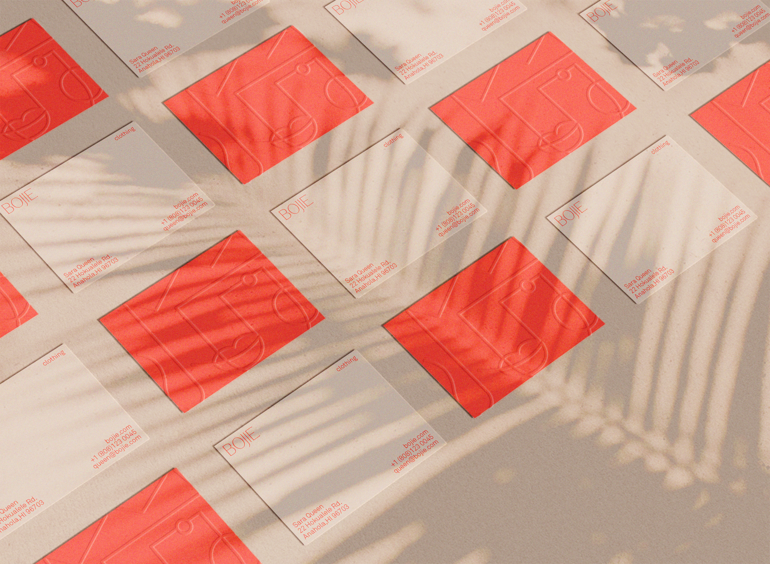
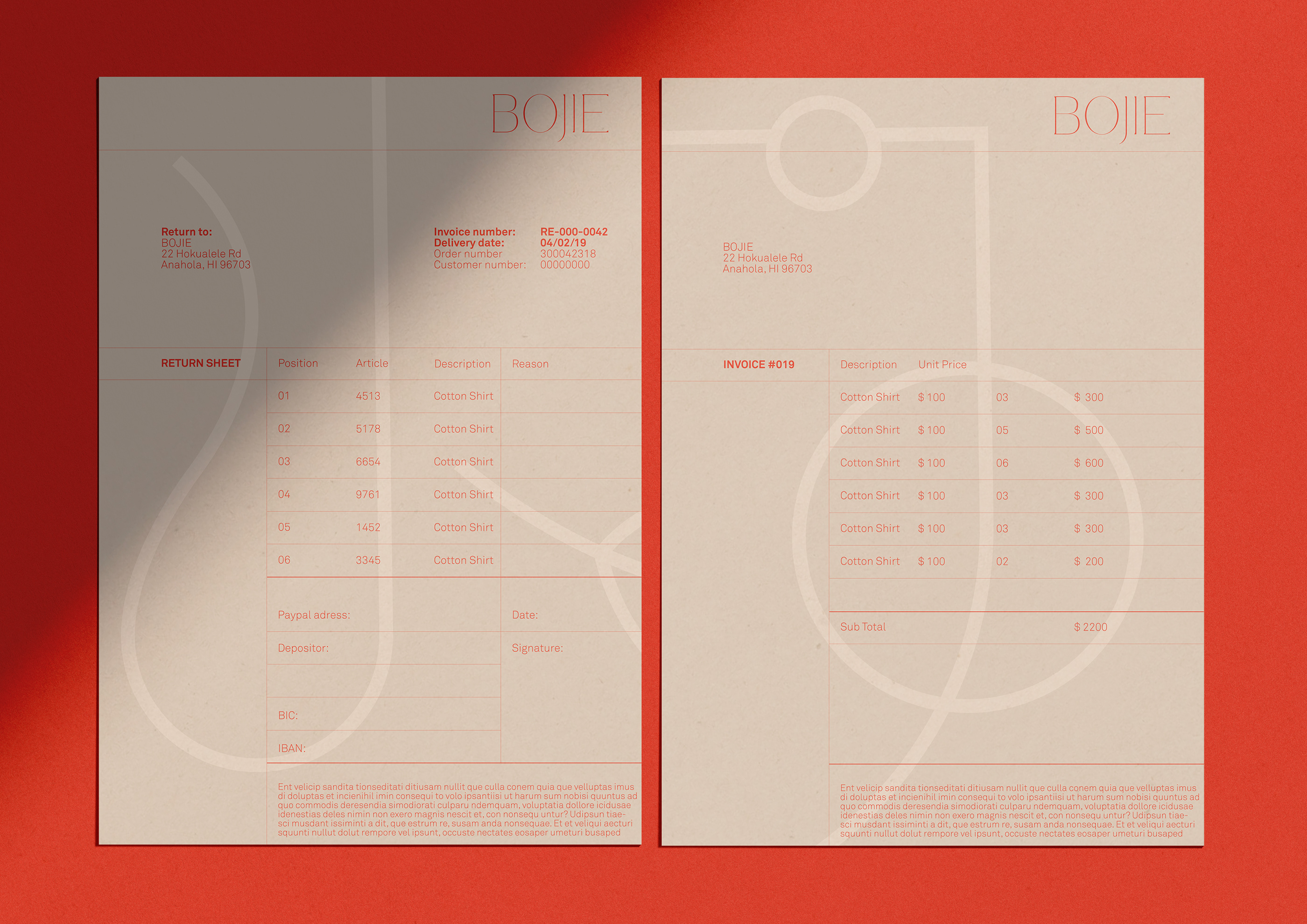
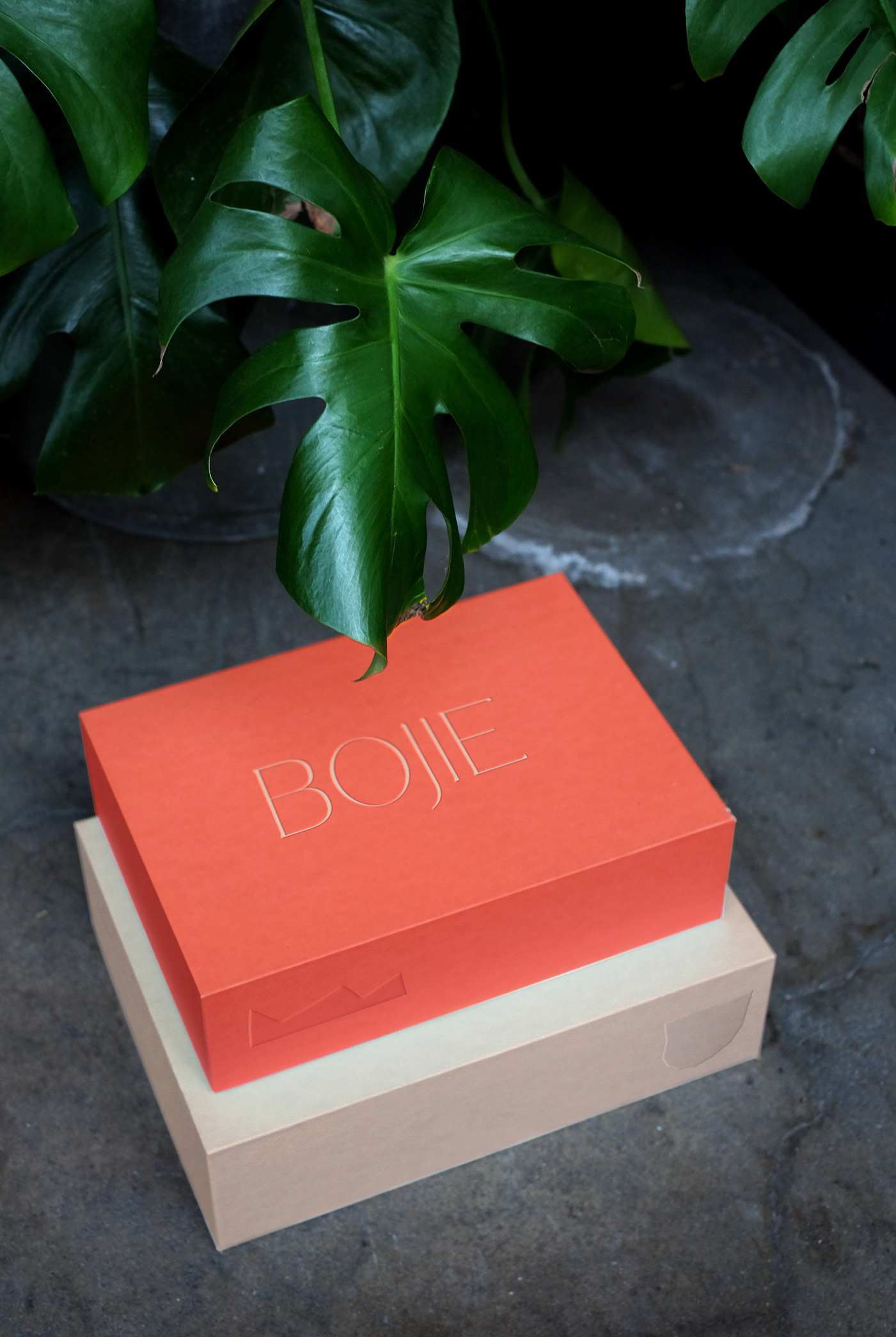
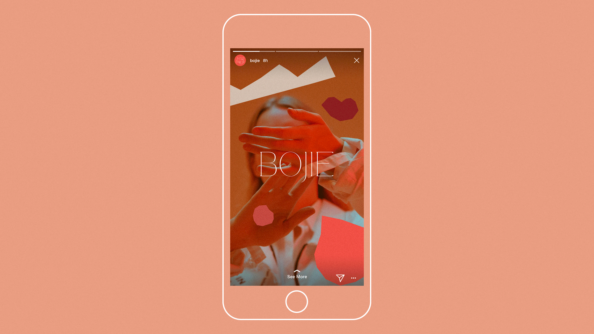
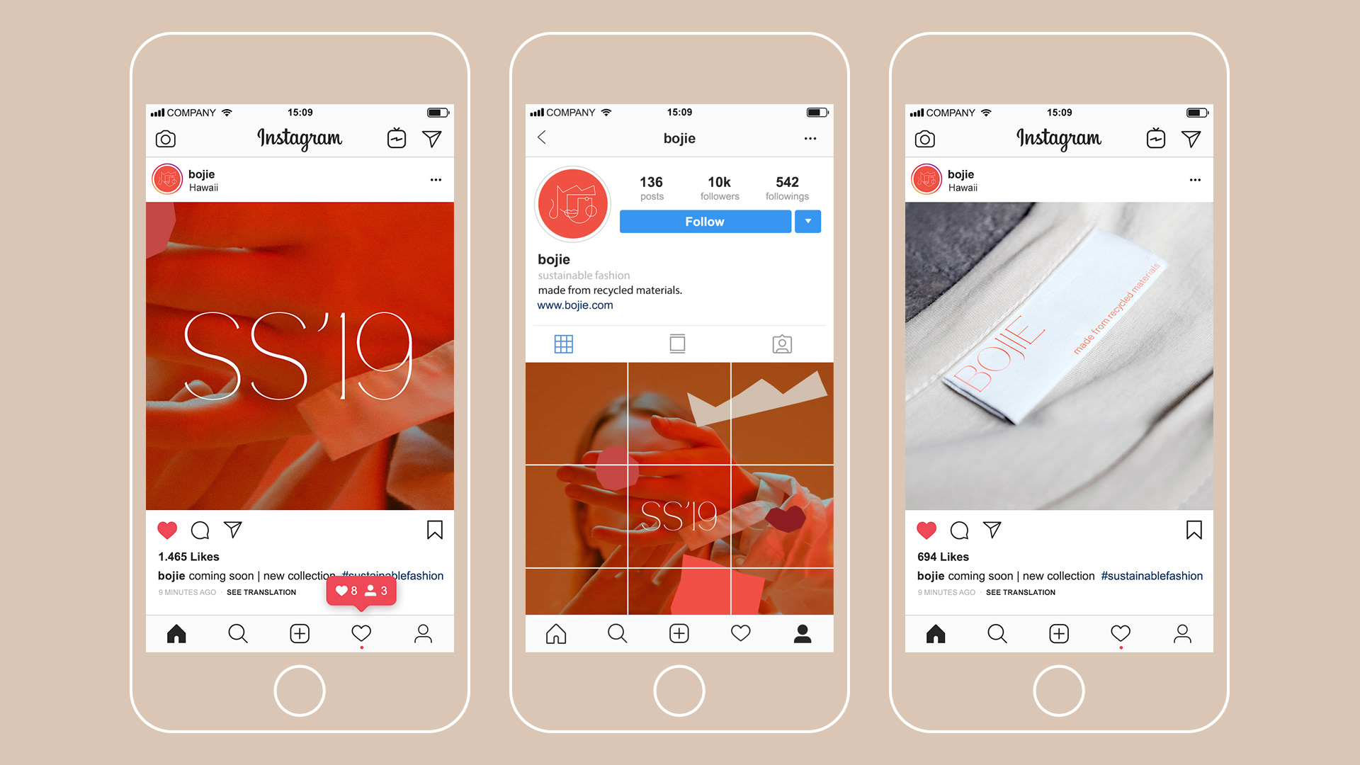
In collaboration with Designstudio B.O.B. we created a warm and expressive corporate identity concept combining abstract shapes with the thin lines of an elegant typography and a minimalistic icon. The icon shows a woman’s face in a very abstract way, inspired by expressionist art from the 20s century. The woman is wearing a crown, which is a reference to the client’s name „Sara Queen“ and gives a personal touch to the brand. The icon can be used as a logo, but also as an additional graphical element. A highly recognizable characteristic of this design is the color palette. The range of different shades of red and beige gives an earthy feeling to the brand.
Bojie is a fashion label from Hawaii which sells conscious women's clothing with a bohemian touch. Its spirit is alive, forward, free, vibrant and flowing – it expresses the female in all forms.
In collaboration with Designstudio B.O.B. we created a warm and expressive corporate identity concept combining abstract shapes with the thin lines of an elegant typography and a minimalistic icon. The icon shows a woman’s face in a very abstract way, inspired by expressionist art from the 20s century. The woman is wearing a crown, which is a reference to the client’s name „Sara Queen“ and gives a personal touch to the brand. The icon can be used as a logo, but also as an additional graphical element. A highly recognizable characteristic of this design is the color palette. The range of different shades of red and beige gives an earthy feeling to the brand.