E150–a [2019]
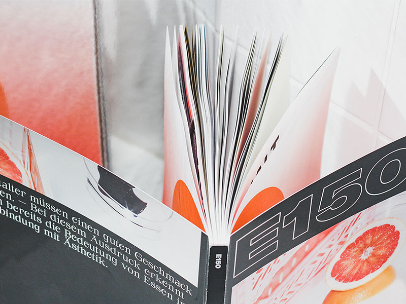
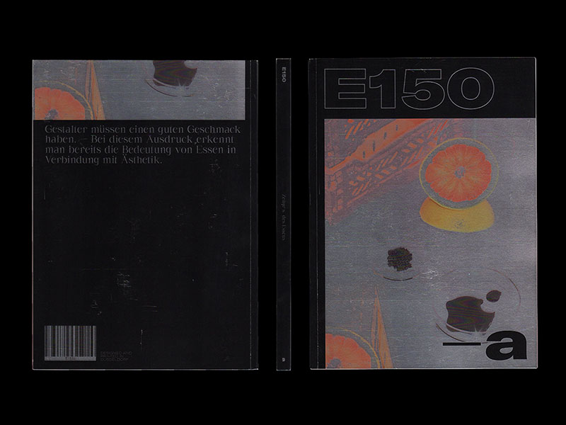
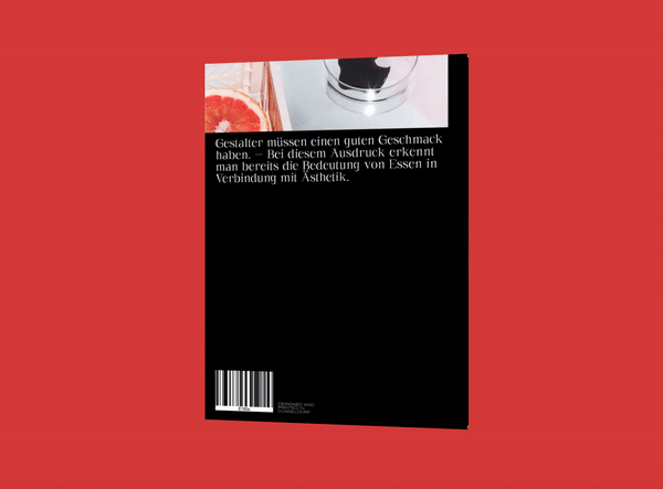
Designers have to have good taste. – With this expression one already recognizes the meaning of food in connection with aesthetics.
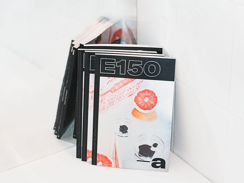
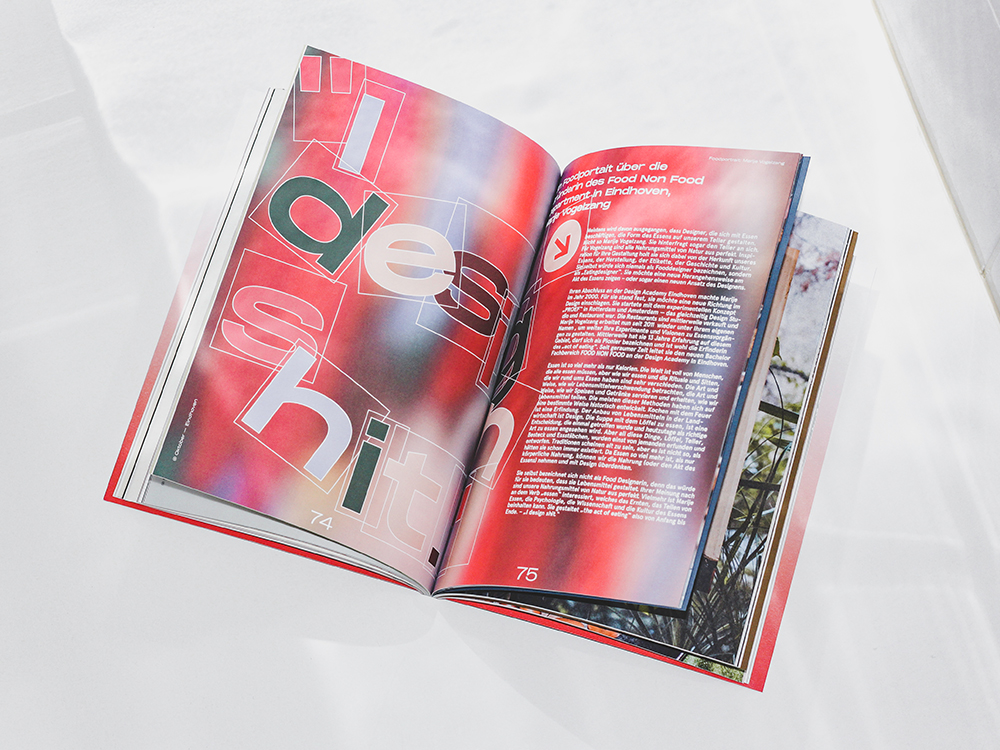
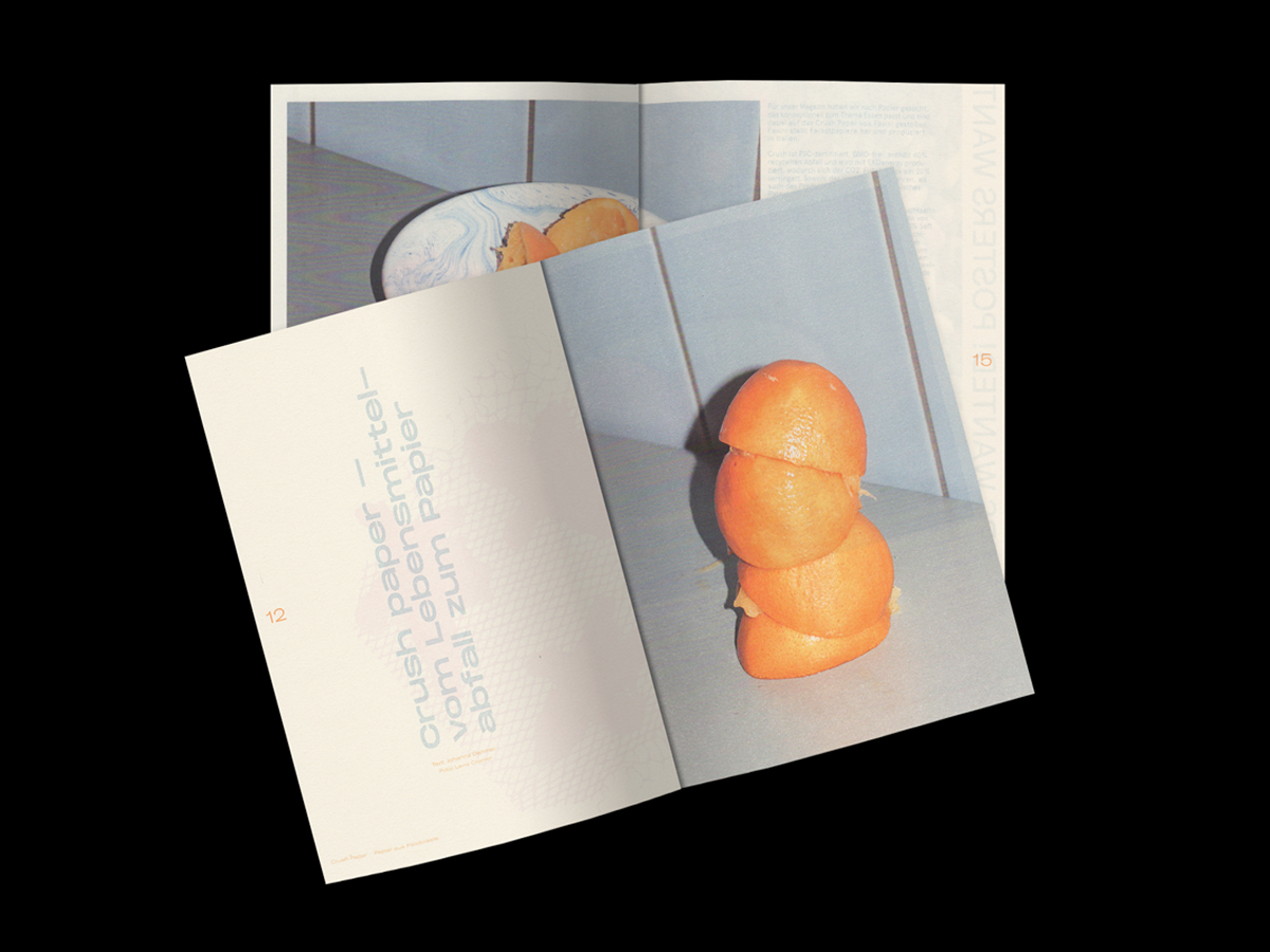
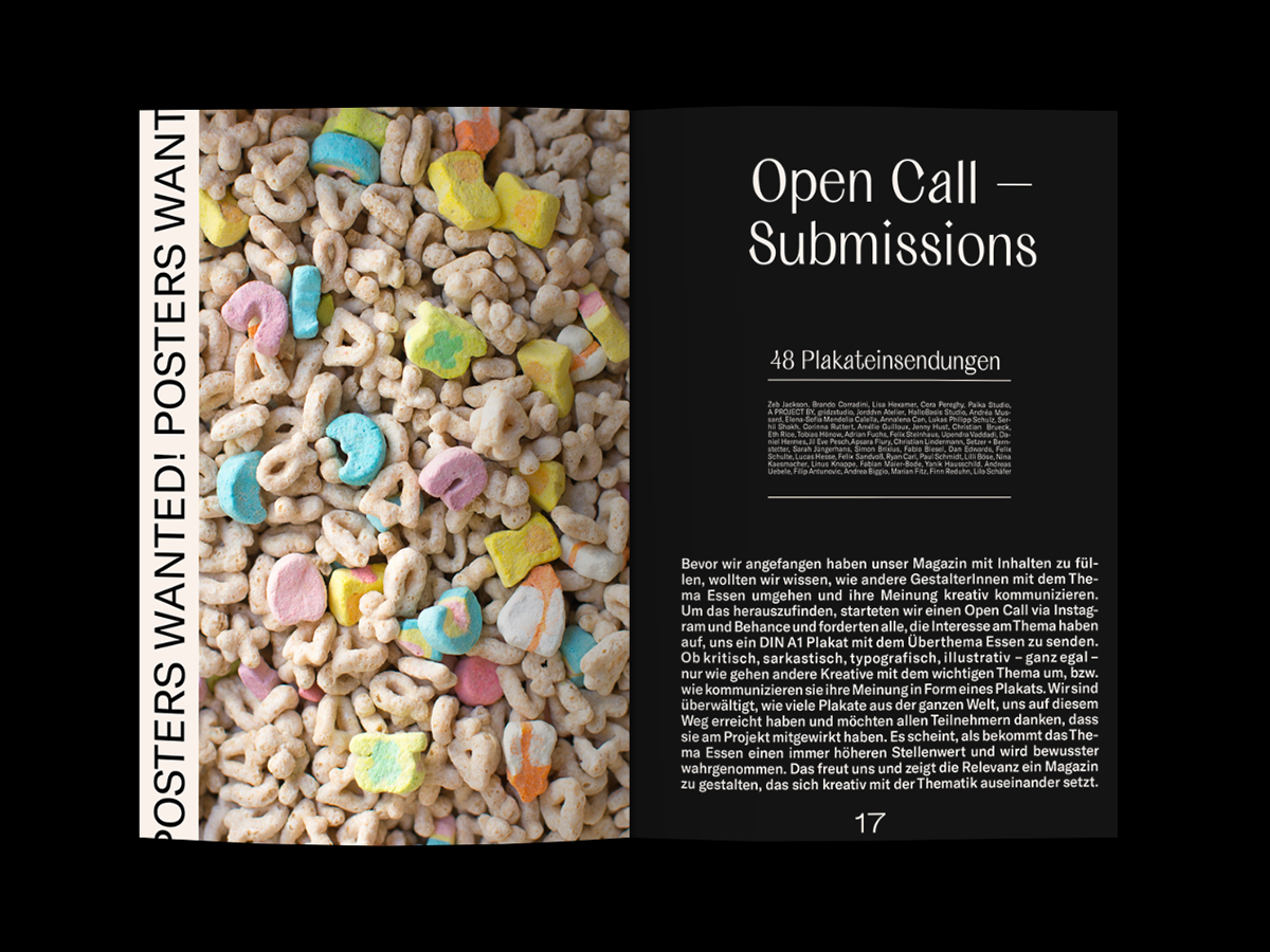
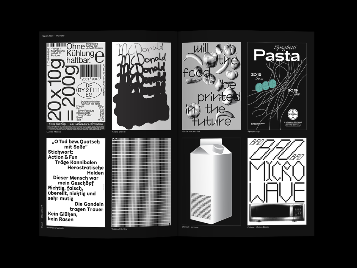
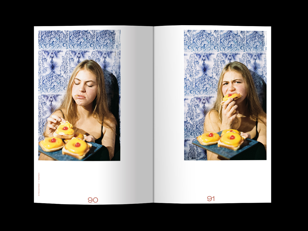
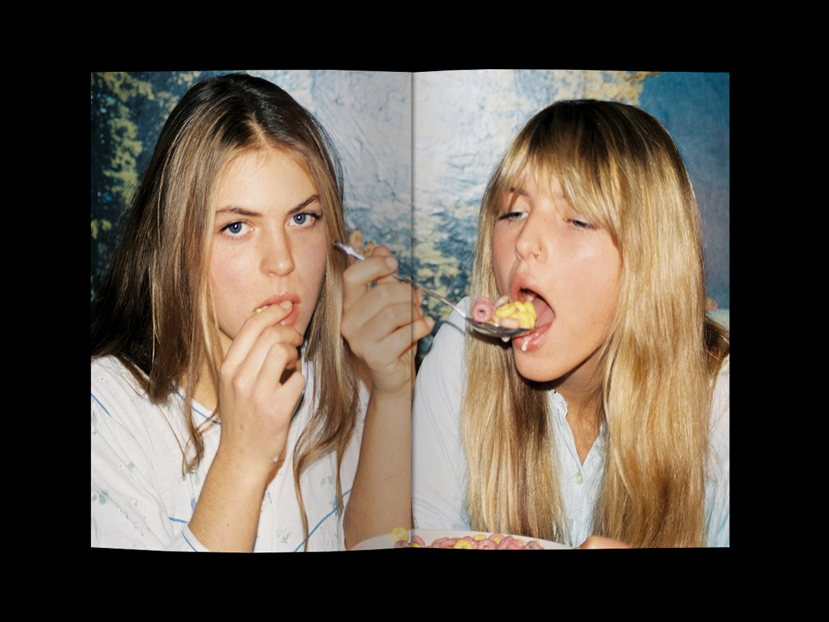
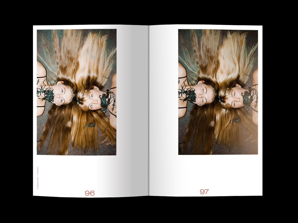
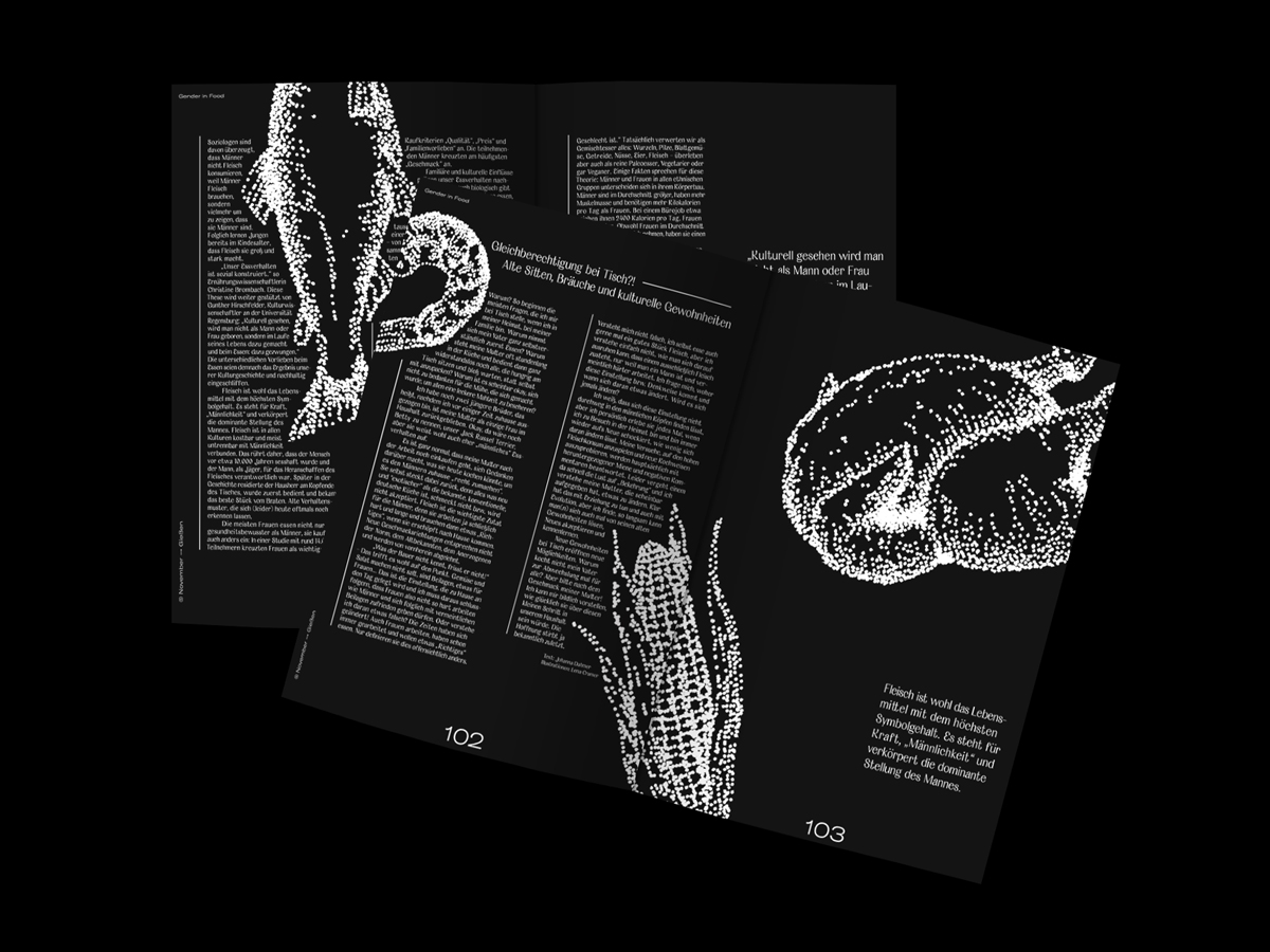
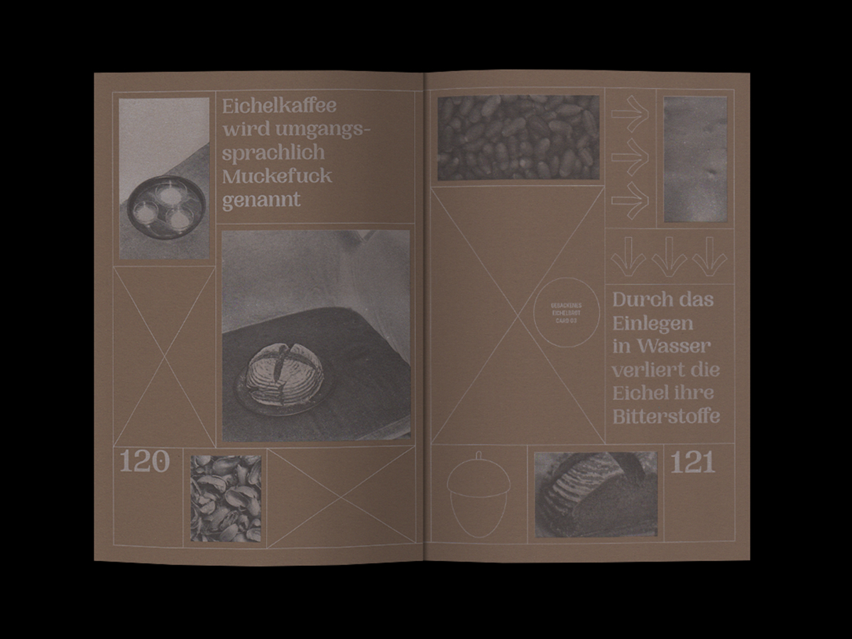
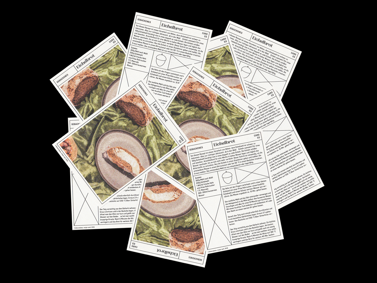
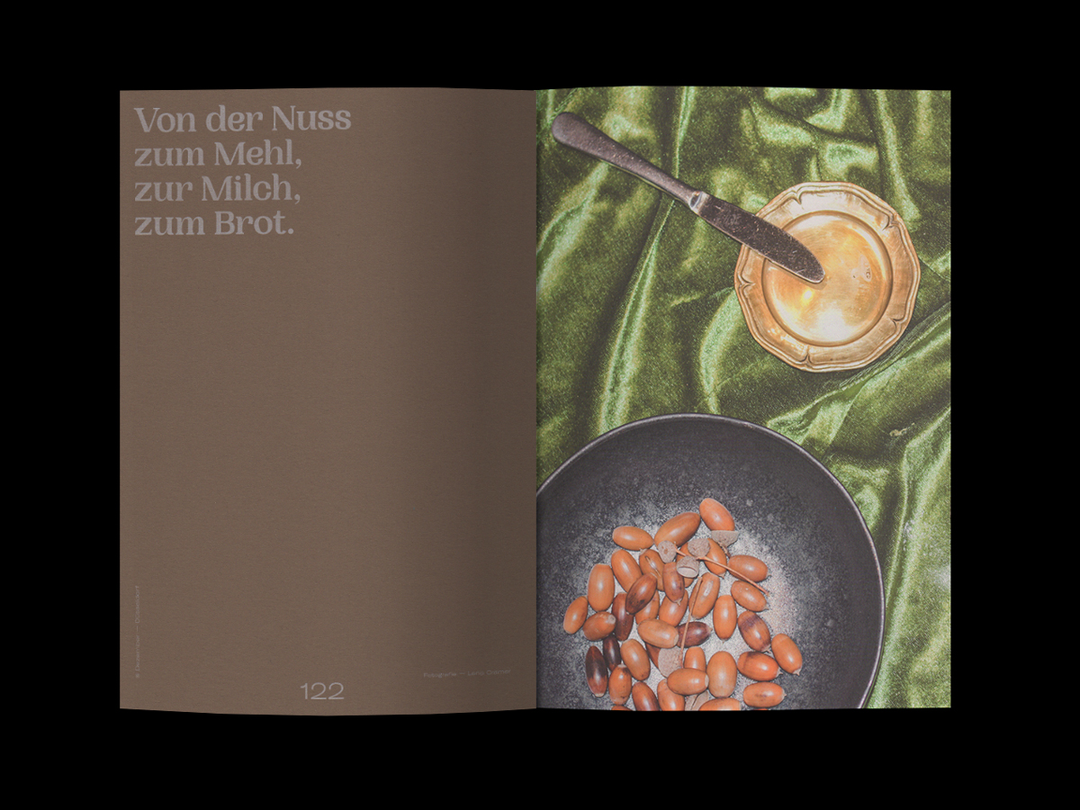
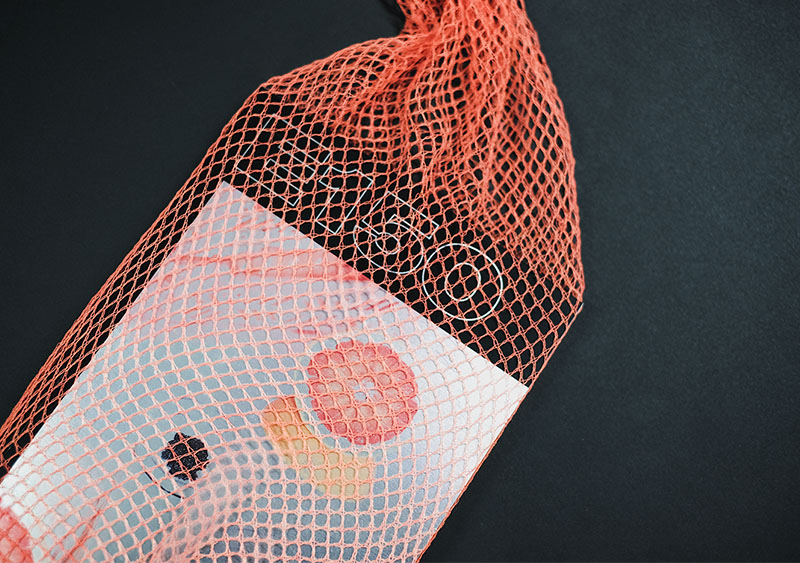
After six months of culinary and experimental travels, we created E150-a, a magazine designed to take the reader on a journey. From Dusseldorf via Berlin to New York, Eindhoven and Giessen – our journey was colorful, loud, exhausting and very inspiring. We want to share this experience with the readers. E150-a critically questions the large topic of “food“, leaves room for the positive and deals with current trends. We want to capture the zeitgeist of food and present it in a graphically appealing way. We all love to eat – we have to eat to survive, but how will our eating behaviors change in the future so that we can continue to enjoy ourselves? How do designers deal with the topic of food? Why do some things disgust us while we are not afraid to put other things into our mouths? Why do we even use cutlery when we have two healthy hands? Meat or meatless? Role distribution at the table? – Many questions and topics which we have wondered about and which continue to occupy us are addressed and dealt with in the magazine. On our trip to this magazine, we talked to a lot of interesting people, heard different opinions, went to different places to discover new trends and, of course, tried everything that was put in front of our mouths. We took photos, organized a workshop, addressed an open call to various designers and tried so hard to immerse ourselves in the topic of food. For printing, we have found a special paper that contains food waste and thus fits thematically and haptically to our topic.
Printing: Risograph / Indigo Digital
Format: 18,7 x 24,8 cm
Binding: adhesive
Number of pages: 146
Paper: Metapaper Recycling Silk 130 gr/m3, Favini Crush Paper 130 gr/m3, Chromolux 300 gr/m3
Cover Font: GT America by Grillitype, Serifbabe by Charlotte Rohde
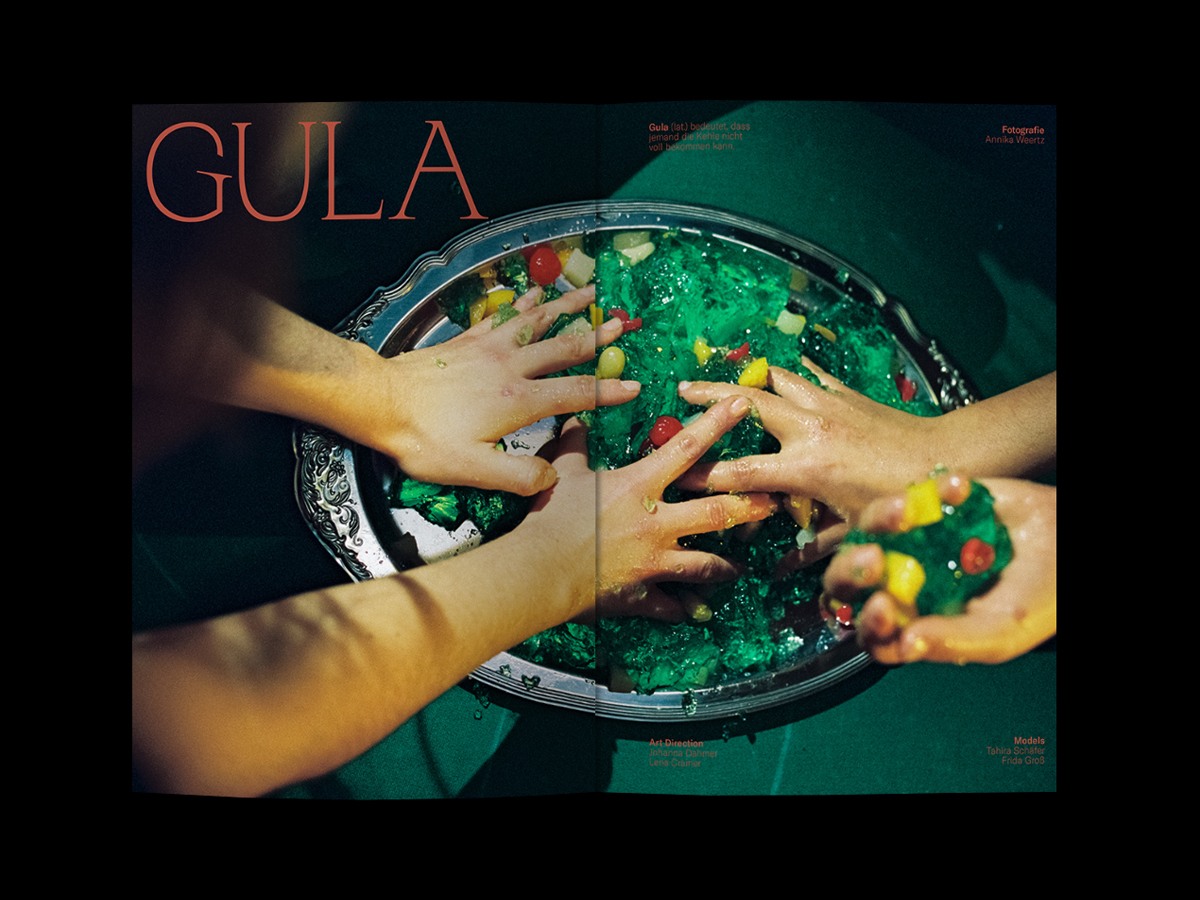
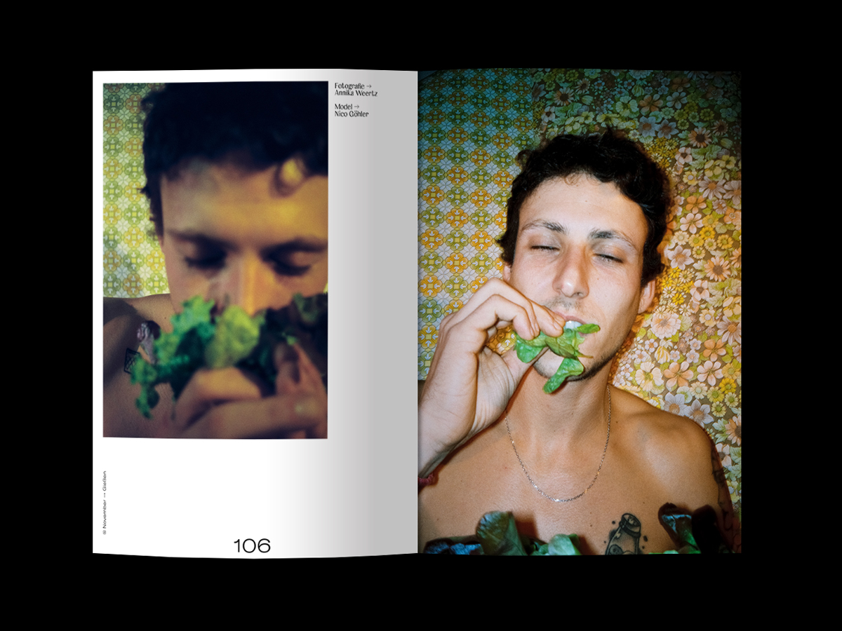
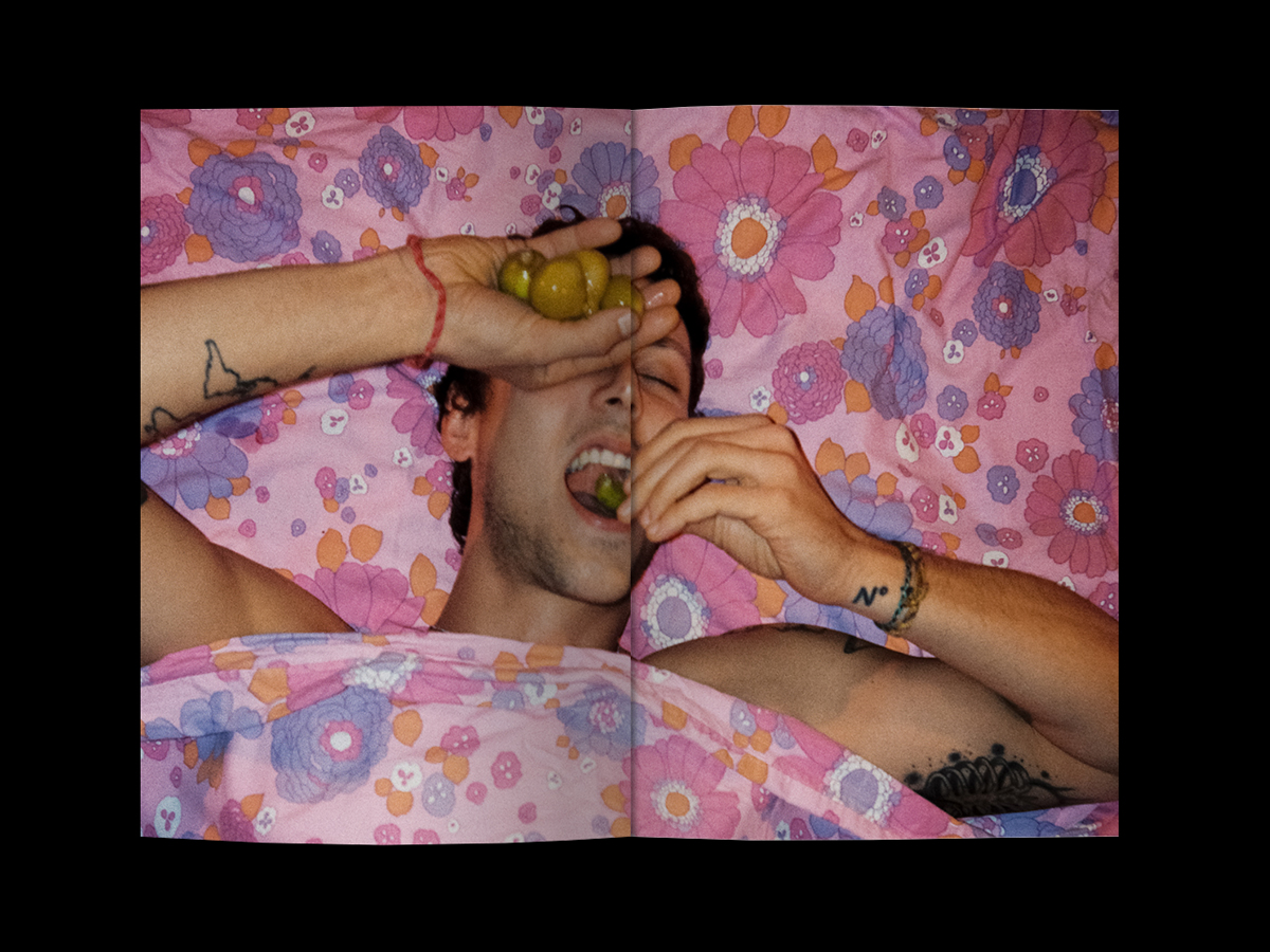
Photo series “gula“ and “gender stereotypes“ by Annika Weertz
Thanks and Bon appétit!
Designers have to have good taste. – With this expression one already recognizes the meaning of food in connection with aesthetics.
After six months of culinary and experimental travels, we created E150-a, a magazine designed to take the reader on a journey. From Dusseldorf via Berlin to New York, Eindhoven and Giessen – our journey was colorful, loud, exhausting and very inspiring. We want to share this experience with the readers. E150-a critically questions the large topic of “food“, leaves room for the positive and deals with current trends. We want to capture the zeitgeist of food and present it in a graphically appealing way. We all love to eat – we have to eat to survive, but how will our eating behaviors change in the future so that we can continue to enjoy ourselves? How do designers deal with the topic of food? Why do some things disgust us while we are not afraid to put other things into our mouths? Why do we even use cutlery when we have two healthy hands? Meat or meatless? Role distribution at the table? – Many questions and topics which we have wondered about and which continue to occupy us are addressed and dealt with in the magazine. On our trip to this magazine, we talked to a lot of interesting people, heard different opinions, went to different places to discover new trends and, of course, tried everything that was put in front of our mouths. We took photos, organized a workshop, addressed an open call to various designers and tried so hard to immerse ourselves in the topic of food. For printing, we have found a special paper that contains food waste and thus fits thematically and haptically to our topic.
Printing: Risograph / Indigo Digital
Format: 18,7 x 24,8 cm
Binding: adhesive
Number of pages: 146
Paper: Metapaper Recycling Silk 130 gr/m3, Favini Crush Paper 130 gr/m3, Chromolux 300 gr/m3
Cover Font: GT America by Grillitype, Serifbabe by Charlotte Rohde
Photo series “gula“ and “gender stereotypes“ by Annika Weertz
Thanks and Bon appétit!