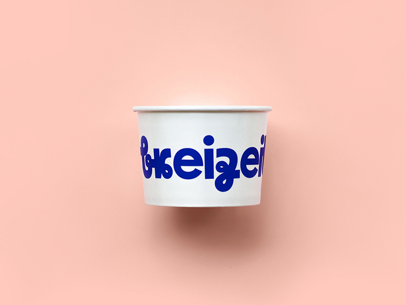
Breizeit [2019]
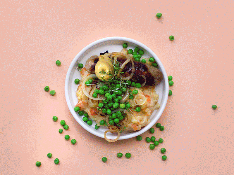
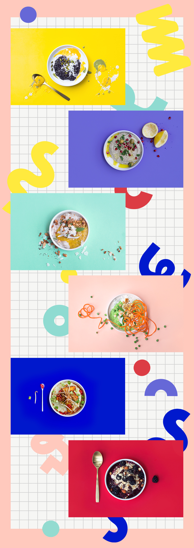
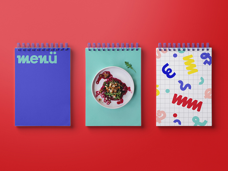
Breizeit is all about joy. It's an experimental food concept for sweet and savory porridge/mash.
The naming is a pun out of the German word “Brei“ and “Mahlzeit“. The whole concept is playful, bright, colorful and should show that “Brei“ is a nutritious meal for everyone – a little snack for the small in-between hunger or an entire meal. A meal with a lot of variation, not just the well-known oat porridge and potato mash. While we worked on this project, we cooked about 30 different kinds of mash. Inspired by various cultures and seasonal offers. From amaranth porridge to rice congee, from buckwheat to beetroot mash and so on. The list goes on and on.
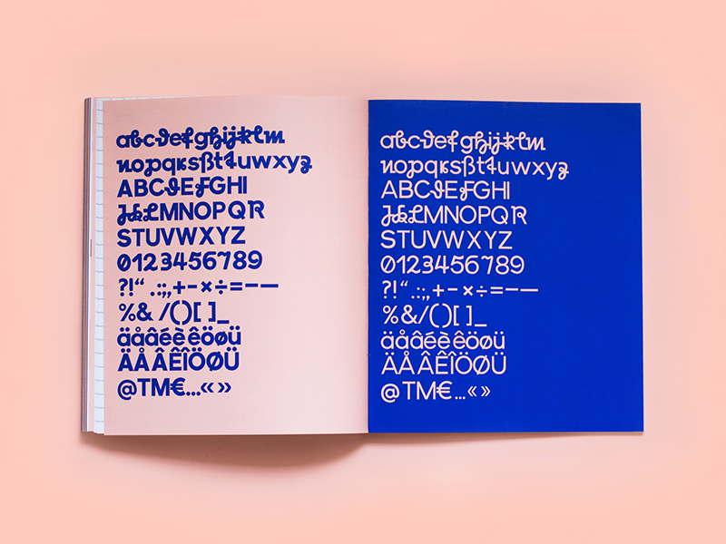
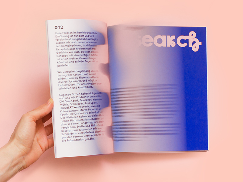
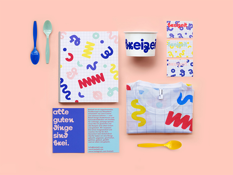
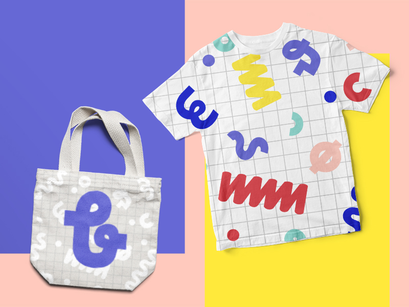
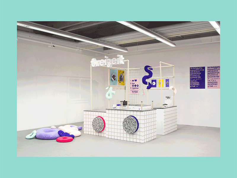
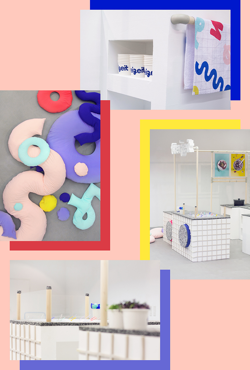
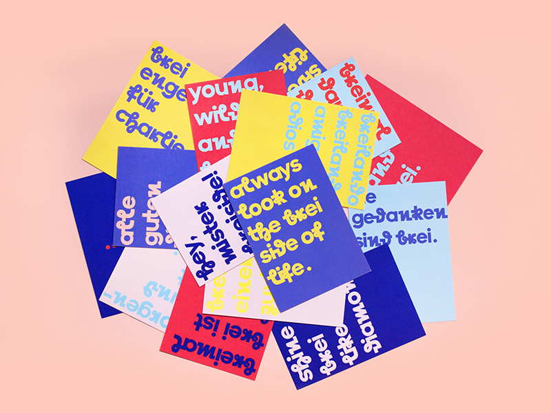
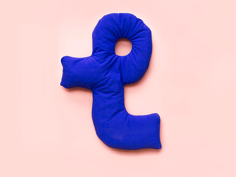
We created a corporate type inspired by an old sütterlin mixed with a modern grotesque type: The Brei Sütterlin. Out of this type we created the logo and used it as a headline type. The look was inspired by old school exercise books, script/cursive writing and Memphis Design. For the Pop Up Stand we tried to use materials that evoke the association of a pulpy mass – light materials like styrodur and foam. The seats are big floor cushions out of shapes from the pattern – so everything becomes a haptic experience. The whole identity is a reinterpretation of the feeling of being a kid again.
Breizeit is all about joy. It's an experimental food concept for sweet and savory porridge/mash.
The naming is a pun out of the German word “Brei“ and “Mahlzeit“. The whole concept is playful, bright, colorful and should show that “Brei“ is a nutritious meal for everyone – a little snack for the small in-between hunger or an entire meal. A meal with a lot of variation, not just the well-known oat porridge and potato mash. While we worked on this project, we cooked about 30 different kinds of mash. Inspired by various cultures and seasonal offers. From amaranth porridge to rice congee, from buckwheat to beetroot mash and so on. The list goes on and on.
We created a corporate type inspired by an old sütterlin mixed with a modern grotesque type: The Brei Sütterlin. Out of this type we created the logo and used it as a headline type. The look was inspired by old school exercise books, script/cursive writing and Memphis Design. For the Pop Up Stand we tried to use materials that evoke the association of a pulpy mass – light materials like styrodur and foam. The seats are big floor cushions out of shapes from the pattern – so everything becomes a haptic experience. The whole identity is a reinterpretation of the feeling of being a kid again.